In this project, we'll make a Web page for the current exhibit at the Manetti Shrem museum, "Wayne Thiebald: 1958-1968". The goal is to develop some front-end skills in using CSS to make responsive designs that work well on a variety of screen sizes, and to practice working with a designer.
Dana, our designer, has given us mock-ups for a design that should appear differently on three ranges of display size: small (like a phone), medium (like a tablet or small laptop window) and large (a window on a desktop monitor or a window almost filling a laptop screen).
The large design requires some Javascript to get working, so it will be due on Monday as extra credit. Since extra credit early in the course is easy to get, and you might need it later, I recommend everyone go for it.
Out assignment is to make a responsive design that works in any width window. That is, we want an implementation that is both responsive and which implements the assigned design. Some hints about what this means:
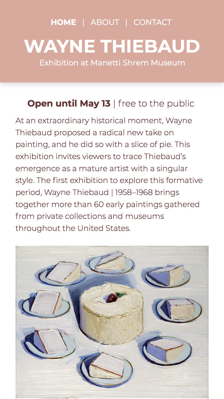
Download Dana's exhibitAssets.zip, which
contains all the mock-ups she made for the page as well as the images
of the paintings.
Make the directory "exhibitAssets" a sibling directory of the
the one that contains the exhibit.html and exhibit.css files you are working
on, so that, for instance, you would put the
bananas image into exhibit.html using a relative path that looks like this:
<img src="../exhibitAssets/Bananas, 1963. Oil on canvas.jpg"> .
This will make it
easier for us to grade!
I suggest you start by implementing the medium-sized design (with three rows of two pictures each). Then use a media query to make changes as necessary to get the mobile version. Finally, use another media query to get the large version, and add a little Javascript to make it respond to clicks on the small images.
Please submit three files: